Podcast Poster
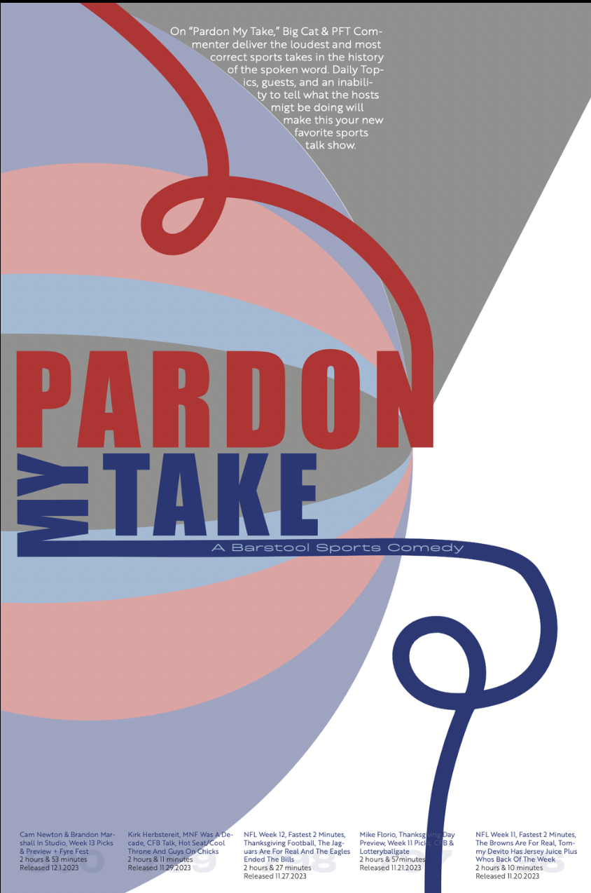
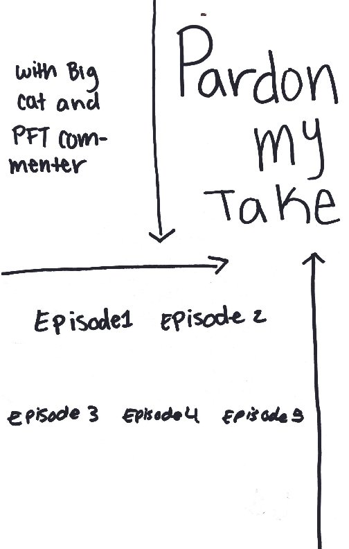
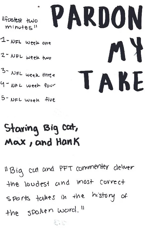
The Podcast Poster was designed with hierarchy and grids in mind to create a successful final poster for the assigned podcast. Through this assignment, the hierarchy and grid mini projects helped significantly with figuring out an effective layout. To include hierarchy in the final design, different typefaces, fonts, colors, placement, and size of the text was implemented. A blocky and bold typeface was chosen for the title of the podcast to give visual weight and a rough sports feel, but the ends of some letters were extended to give the design a fun, playful, loose, and comedic feel. The title was made much larger than the rest of the text and is bright red and blue to make it stand out in comparison to the black, white, and faint blue colors of the rest of the text. A small, simple, and clean typeface was used for the rest of the text. The second principle used in the poster was an underlying grid. A grid was used to help organically place the text and shapes while still maintaining structure. A red, white, and blue color scheme was used to give the standard American football and barstool sports colors. Lastly, simple geometric shapes, inspired by Kieler Woche, are in the foreground of the poster to give a sense of playfulness and help tie in the color scheme. The overall composition is unified and considers hierarchy, grid use, and the theme of masculinity and comedy to create a successful design.


