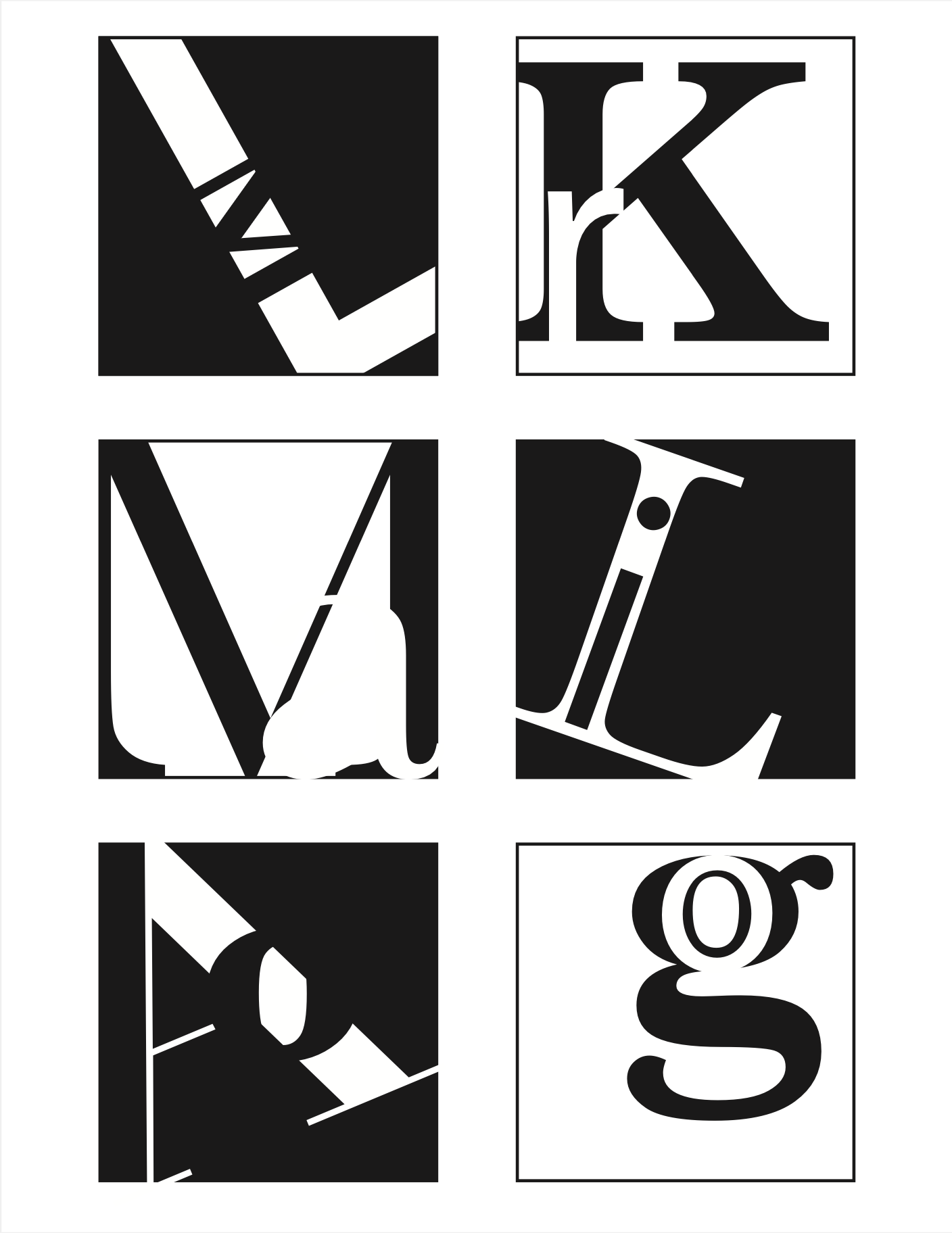
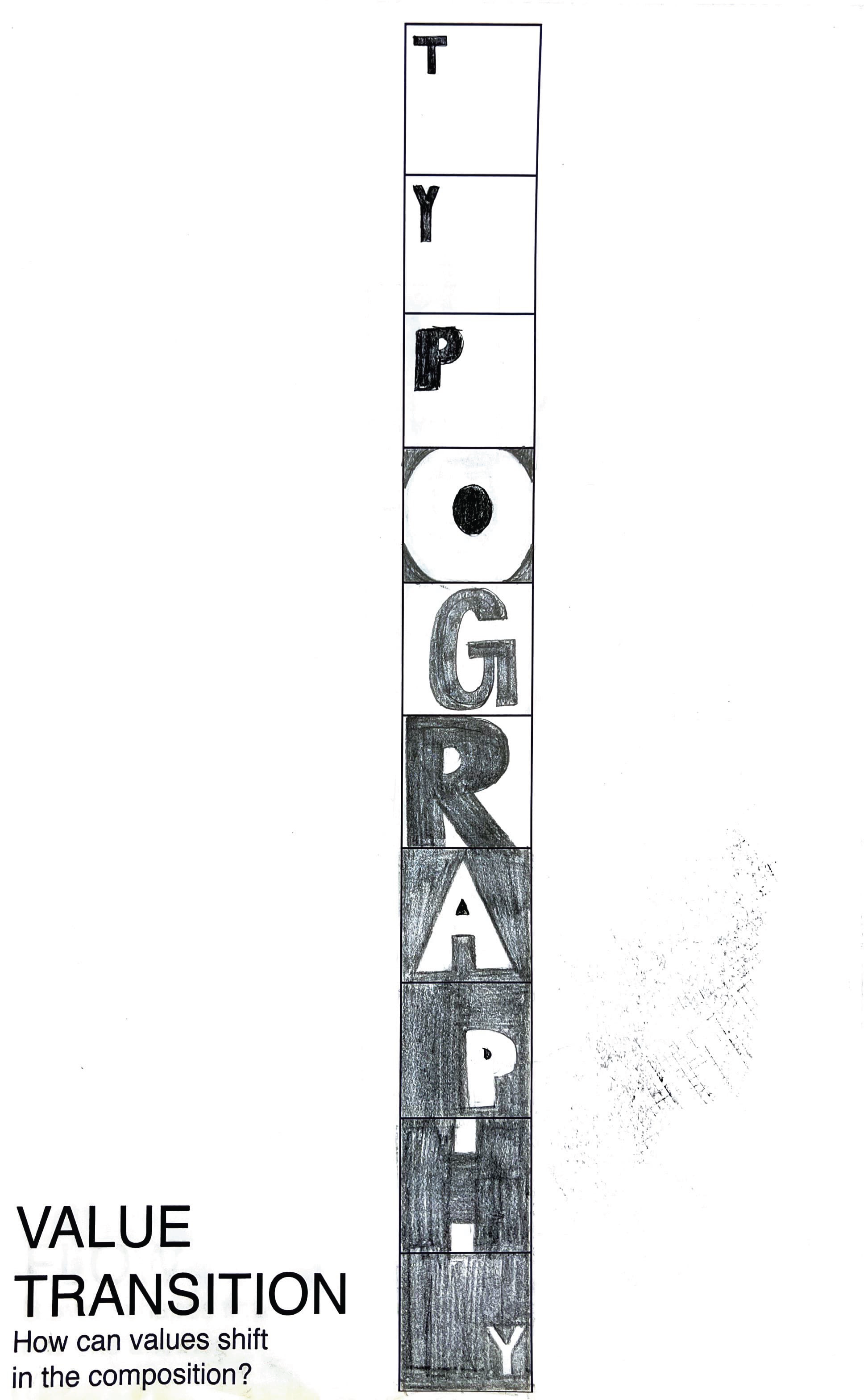
Sequential Figure Ground
To achieve a successful design for the Sequential Figure Ground, Gestalt principles were the focus of the design. To include Gestalt’s principle of closure, a white four was placed inside of the black O cutting off the right side leaving it up to the viewer to finish the whole letter form. To include continuation, flowing letterforms such as the G and the 5 lead the eye from left to right. Rhythmic patterns were explored by switching between black-and-white foregrounds and examining the directionality of the letterforms and numbers. The principle of shape was incorporated into the design by experimenting with typefaces to have a mix of serifed, bold, italicized, and san serifs, creating various shapes. Bolder typefaces and numbers were placed next to script typefaces to achieve visual balance and contrast. The Sequential Figure Ground final design is ambiguous, yet the letterforms are still visible and legible. By considering the entire figure and ground area, a balance between ambiguous, stable, and reversible forms is achieved.


