Album Cover
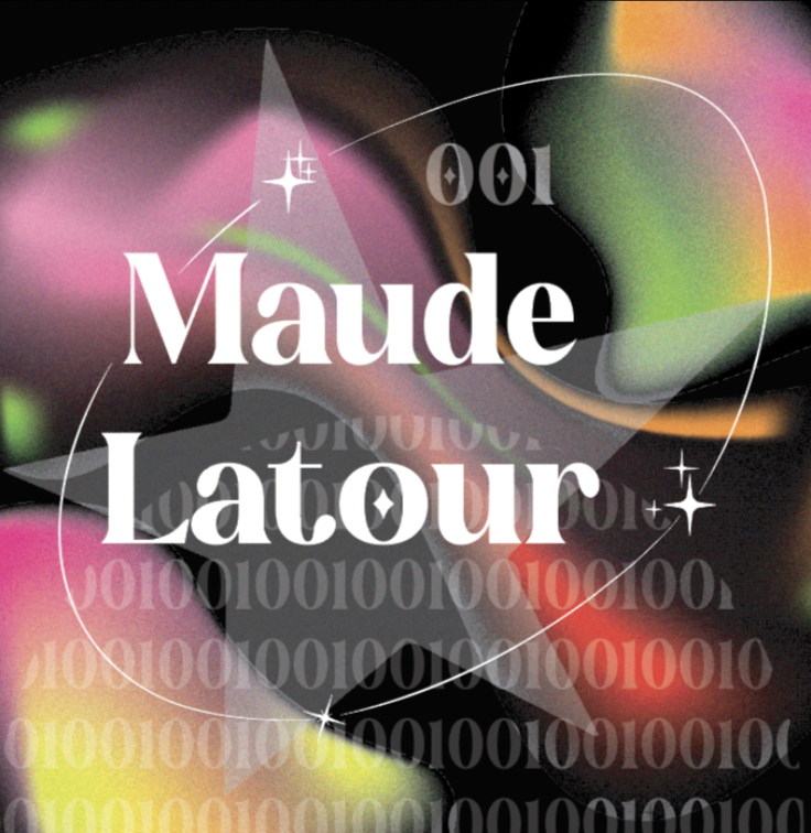
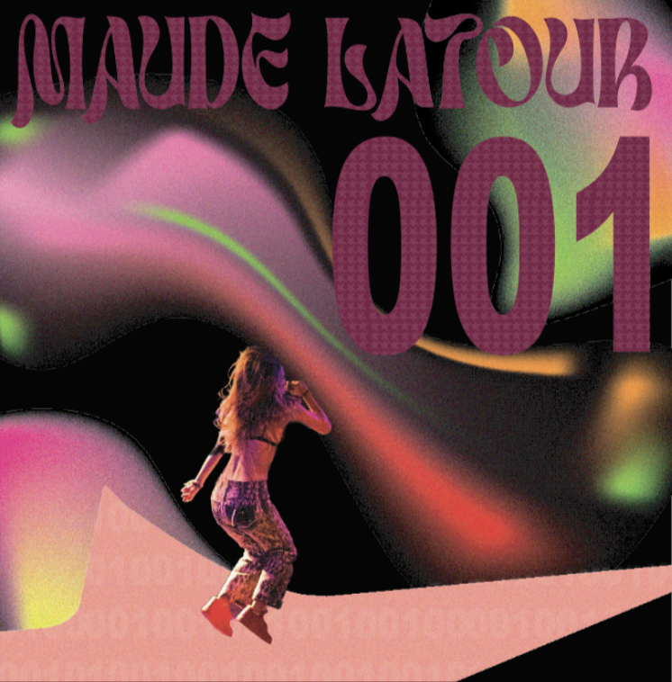
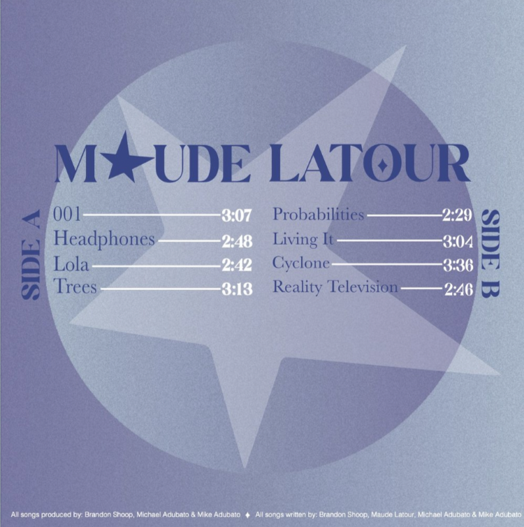
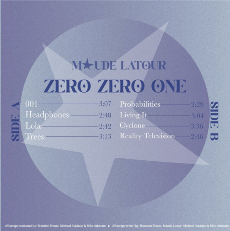
In the Album Cover, design elements such as color, type, and pattern were all considered to achieve a unified system. The monochromatic color scheme was chosen to match the image of the artist on the front sleeve, and the purple-to-blue gradient complements her makeup. Designing with both a simple and decorative typeface helped establish the hierarchy of the text and the reading flow. A repetition of the album name, 001, was made into a custom pattern and filled a circle to incorporate patterns. Pattern was also used in the zoetrope; a repeated shooting star created the illusion as if they were shooting out and away from the center label. For the labels, each side was designed to be slightly different but still similar to each other to help the user distinguish between side A and side B. The same color scheme used on the sleeves was used on both the labels and zoetrope. By consistently sticking to a color palette, all the separate elements can be viewed as a set and have a sense of unity with one another. For the final design of the sleeve, labels, and zoetrope, hierarchy, layout, and unity were all considered to create a meaningful and successful design fitting for the chosen artist and album.
Front of Album Design
Back of Album Design

Process Work


